

0-1 brand creation
for carbon reform
Role: Head of Marketing
Focus: Brand Architecture Positioning Mission and Values
Product Naming Photography Direction Brand Guidelines
Timeline: 2 months launch + 12 months iteration
I rebuilt Carbon Reform’s category language and brand identity so the technology was easier to understand, sell, and adopt. Project resulted in:
Sales conversations started with outcomes, not explanation.
First non-pilot commercial customers and pipeline with Fortune 500/1000 prospects.
Internal alignment on how the company and products were communicated
context and problem
When I joined, Carbon Reform had an early-stage, investor-oriented brand that emphasized vision over value. It did not clearly communicate what the product did, the problem it solved, or the outcomes customers could expect. Visual and verbal cues signaled eco-friendly products rather than a commercially ready energy reduction system, and internal teams used inconsistent language to describe the same technology.
The business could not scale if every conversation began with defining what Carbon Reform was. Branding needed to establish identity, credibility, vocabulary, and clarity of value so discussions could start at feasibility, impact, and decision-making.
strategy
1. visual branding
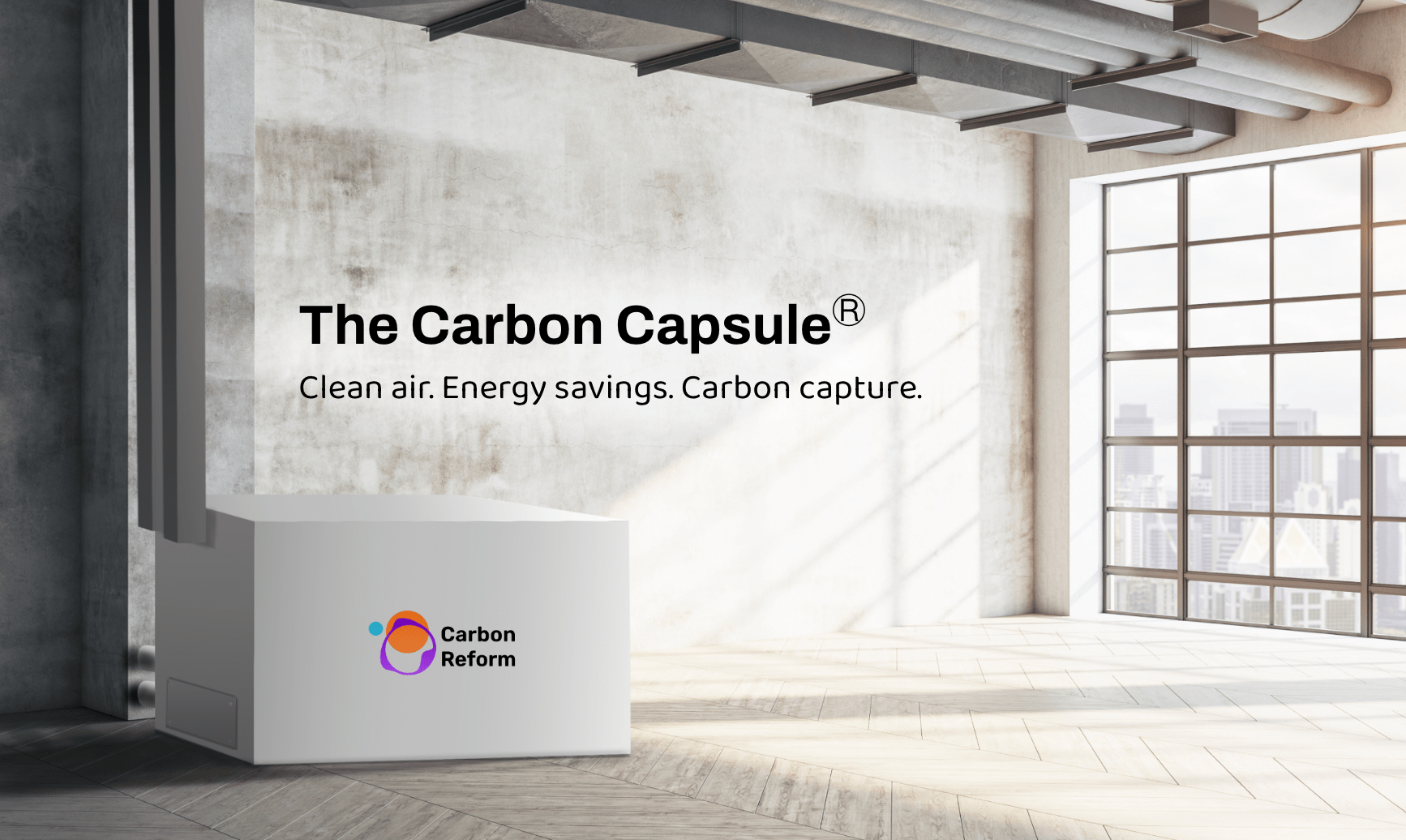
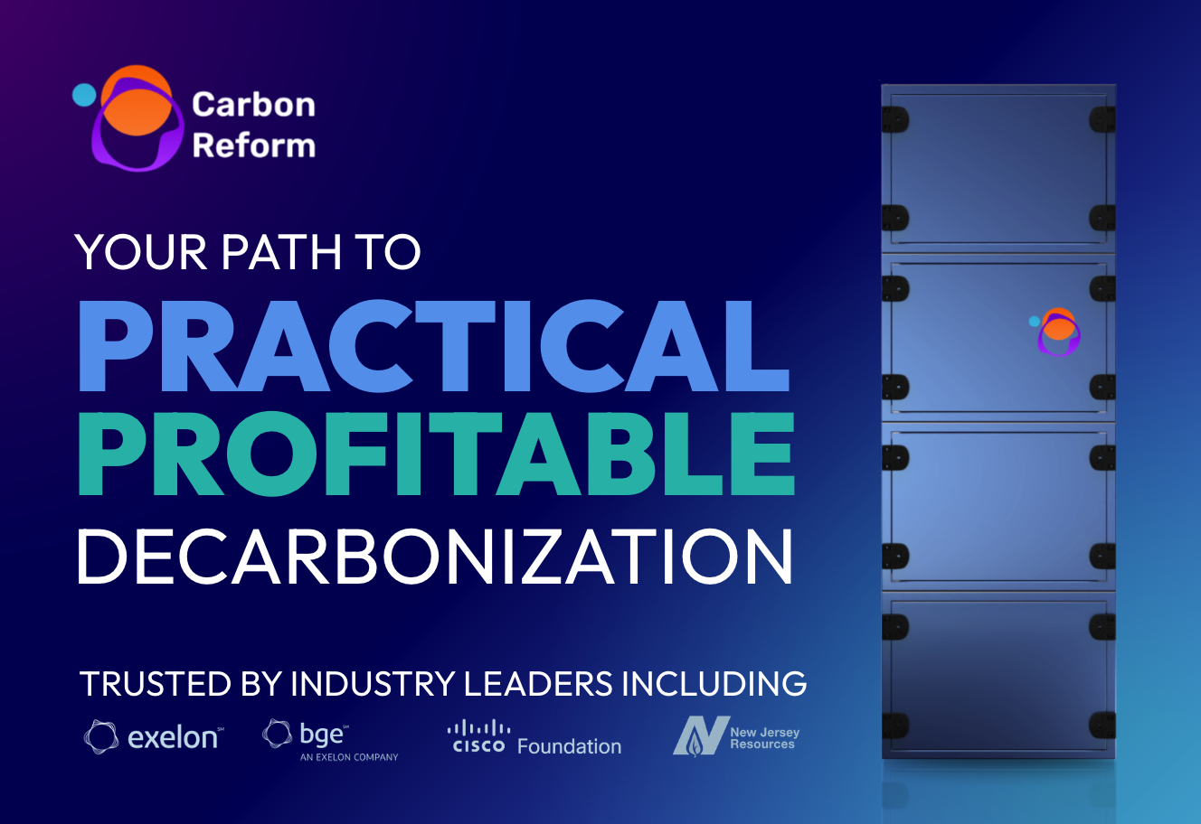
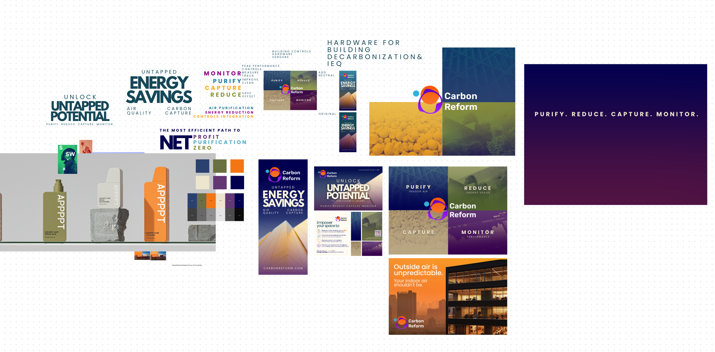
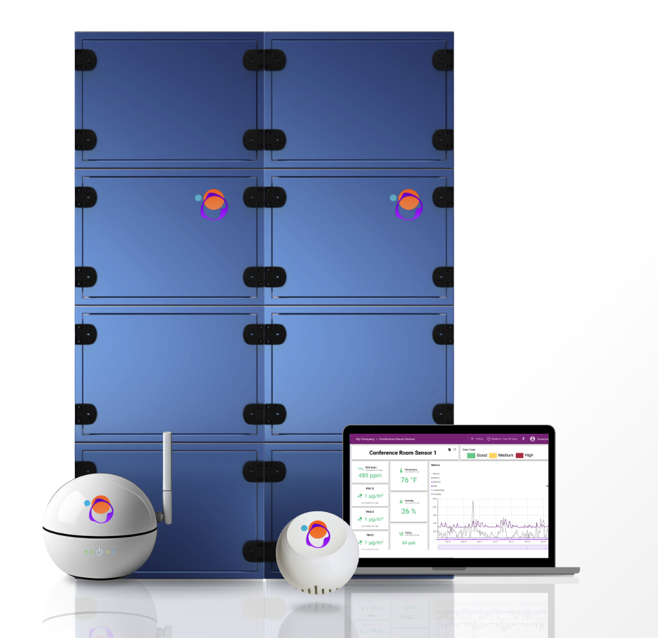
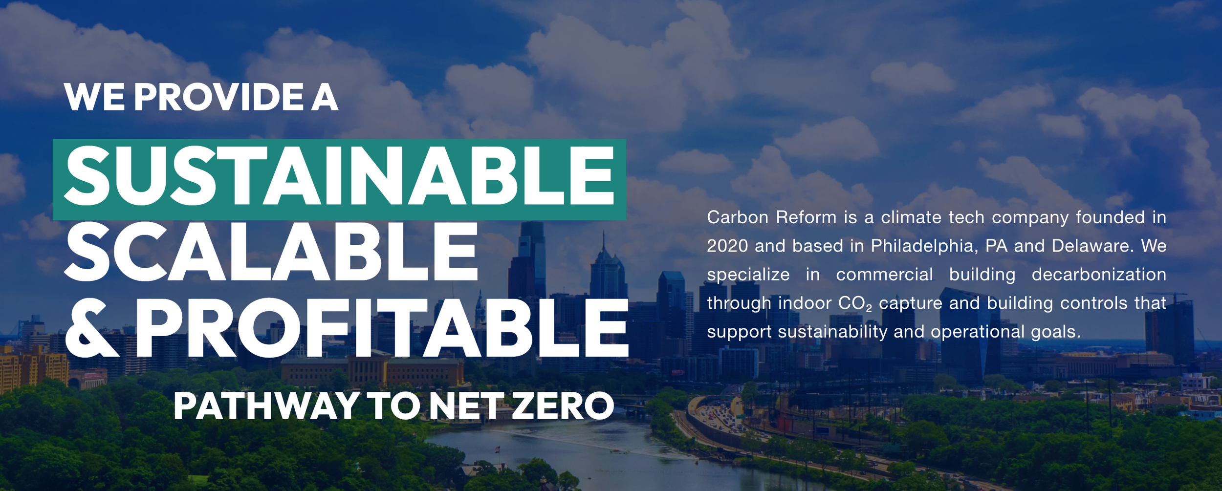
I shifted the visual system away from soft, idealistic sustainability, toward commercial-ready tech company. Early design exploration included jewel tones and cream typography, later refined into a system that uses blue for trust, pinks for approachability, and green for professional sustainability cues. Premium gradients and product-forward photography signaled commercial readiness and helped buyers justify the technology internally as a solution they could purchase and implement.
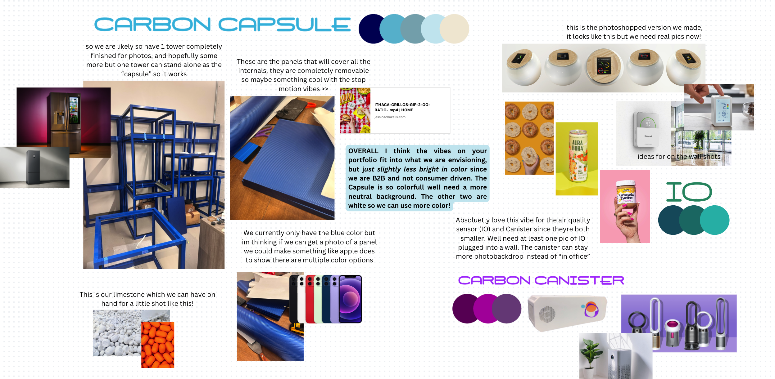
Early design concepts and photography direction for finished commercial products.

2. verbal positioning
I clarified the company’s mission, vision, values, and product positioning to align internal and external narratives. This created a shared understanding of who Carbon Reform is, why it exists, and how it should be discussed across customers, investors, partners, and employees.
The same category language, value framing, and identity were applied across the website, sales conversations, investor materials, press, and product documentation so the brand reinforced itself at every stage of evaluation. Brand Guidelines were created for internal teams and external vendors were required to reference before communicating about the company or product, preventing narrative drift as the company scaled.
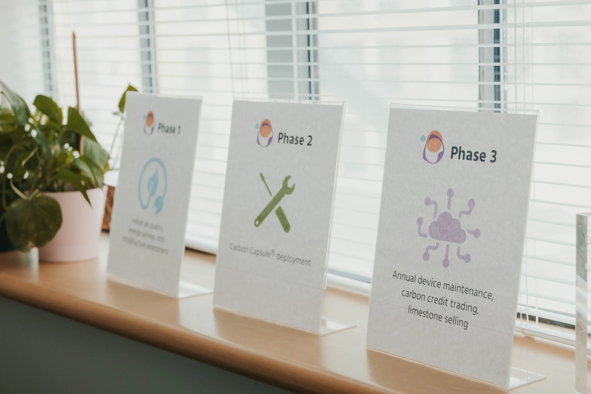
3. product category creation
I positioned the technology as a “drop-in ECM” to anchor understanding in a familiar energy framework for facilities managers, while introducing “indoor carbon capture” as the mechanism for building-level emissions reduction. This pairing made a new solution easier to evaluate without re-education and corrected misconceptions tied to large-scale carbon capture.
The main strategy here was reframing sustainabiity tech from a virtue to a commercial outcome. Emissions reduction was positioned as direct cost savings, and sustainability leadership as a competitive lever tied to financial return, tenant appeal, regulatory compliance, and reputation.

Execution
Built full Brand Guidelines to codify identity, language, visual standards, value proposition, and mission
Wrote mission, vision, values, and positioning statements
Defined naming systems, category language, and value proposition hierarchy
Directed and executed the full visual identity including palette, typography, spatial elements, and photography
Enabled creation of collateral and templates by establishing foundational language and identity, detailed in the Sales Enablement case study
iMpact
Conversations shifted from “what is it” to “how does this work for my building”
First non-pilot commercial customers closed after refreshed brand launch
Prospects began repeating category language and referencing Carbon Reform by name
Internal teams aligned on consistent terminology and could speak to value without prompting