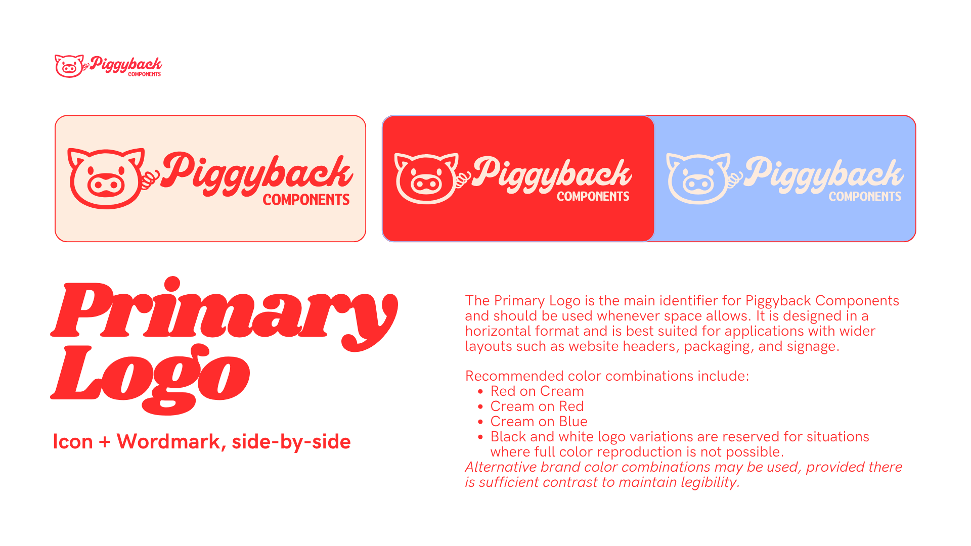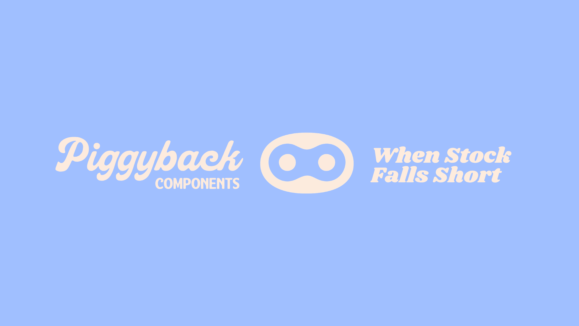
branding and logo design
for piggyback components
Role: Freelance
Focus: Branding Logo Design
Timeline: 2 weeks
I led the brand strategy, naming, and visual design for Piggyback Components, a new performance parts company built for riders who want to push beyond stock. The category is dominated by black, white, and “outdoorsy” brands that lean aggressive and male-centered, making it difficult for new entrants to stand out while still feeling credible.
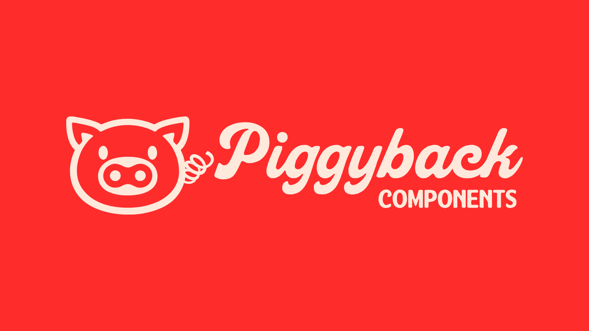
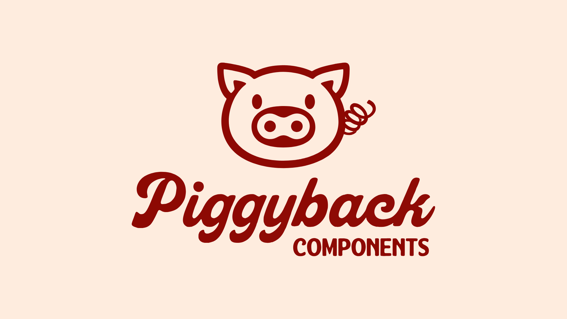
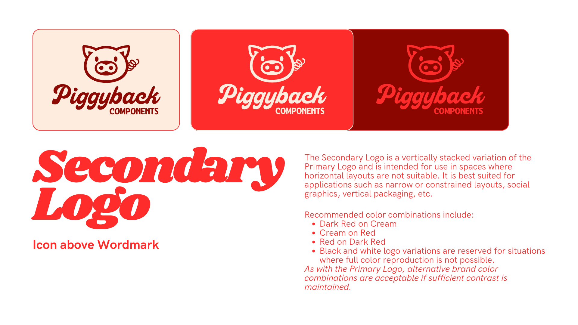
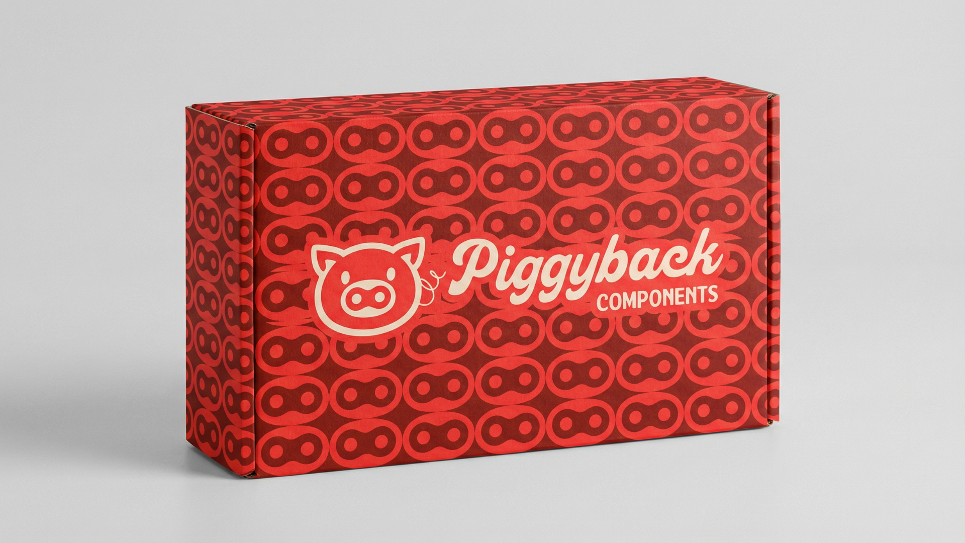
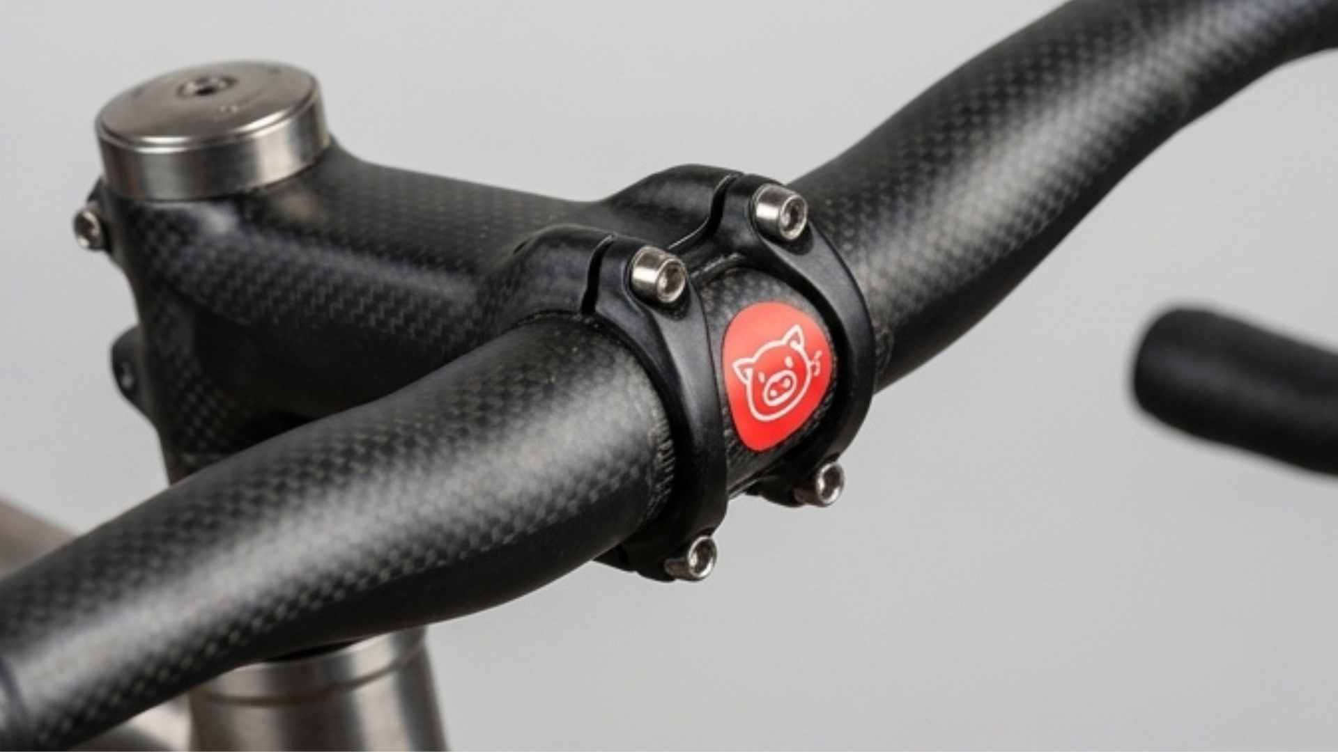
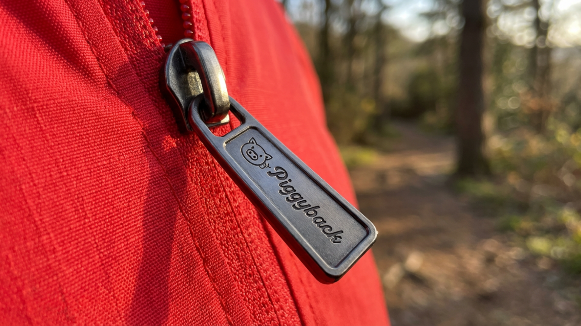
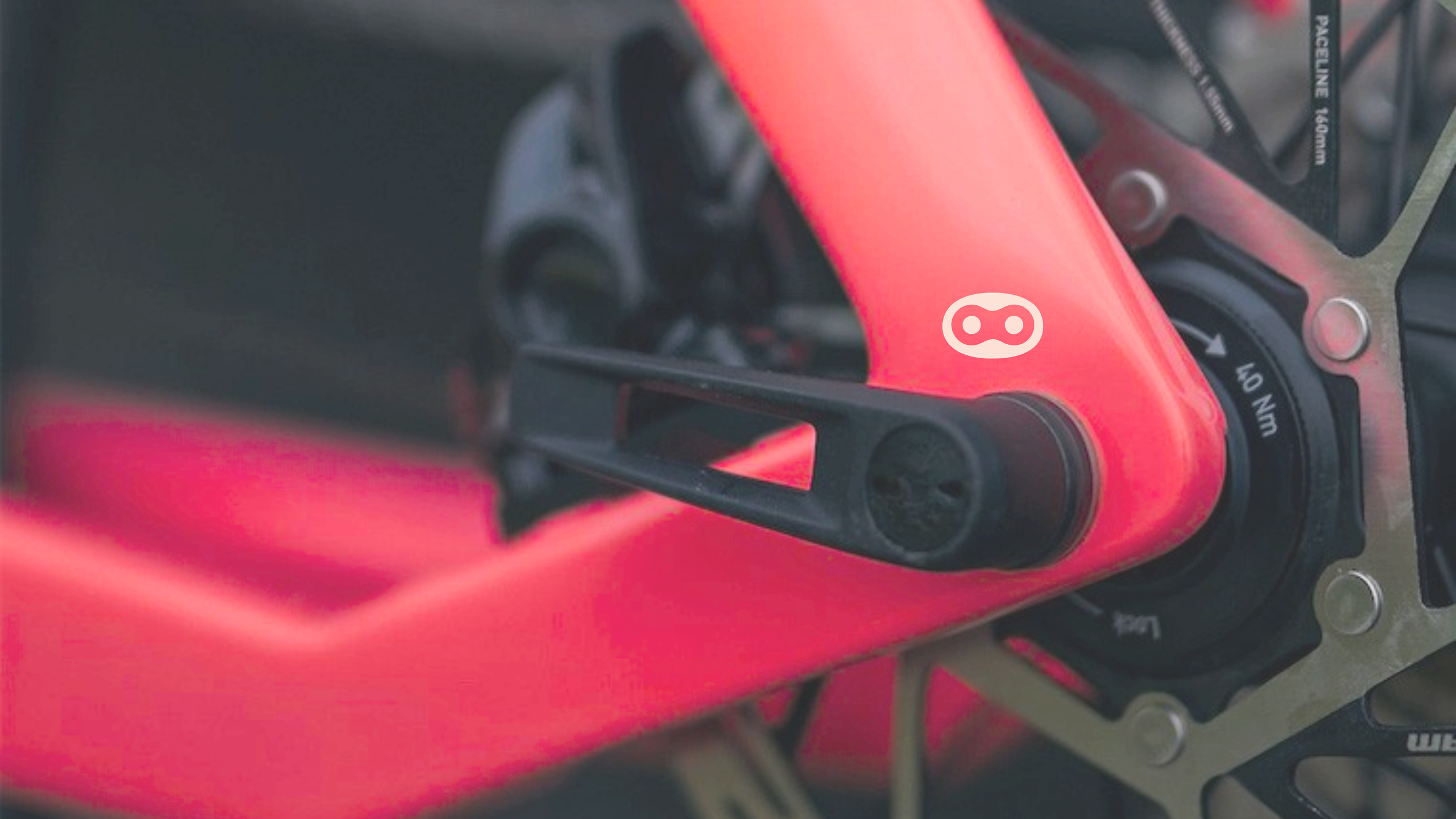
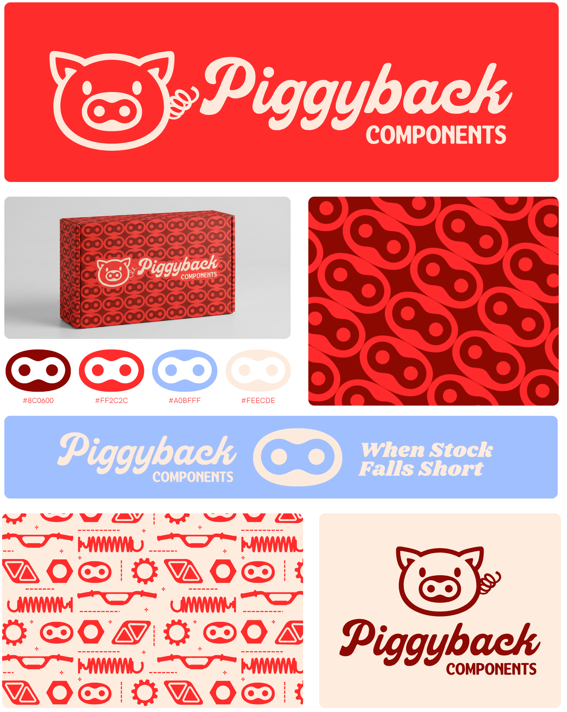
My approach was a bold, playful identity that breaks from the category’s harsh, male-centered norms. Built around a distinctive pig mark and a system of rounded, mechanical forms, the identity introduces a more approachable tone while maintaining a sense of performance. The system is designed to scale across components, packaging, apparel, and digital, giving Piggyback a recognizable presence from day one.
context & thought process
The name Piggyback reflects both a functional component in cycling and the idea of building on what already exists, which aligns well with the brand’s role in creating add-on performance upgrades. This concept informed a system designed to feel additive, adaptable, and grounded in the product itself.
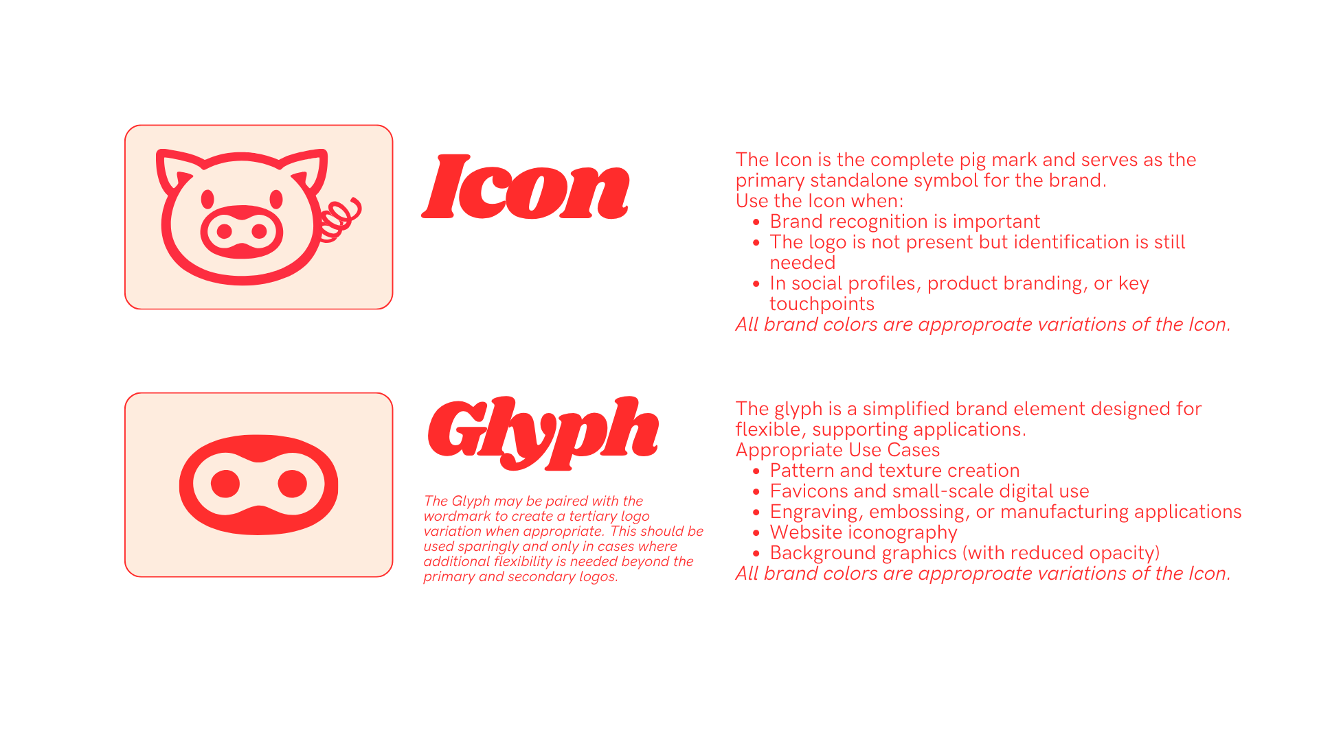
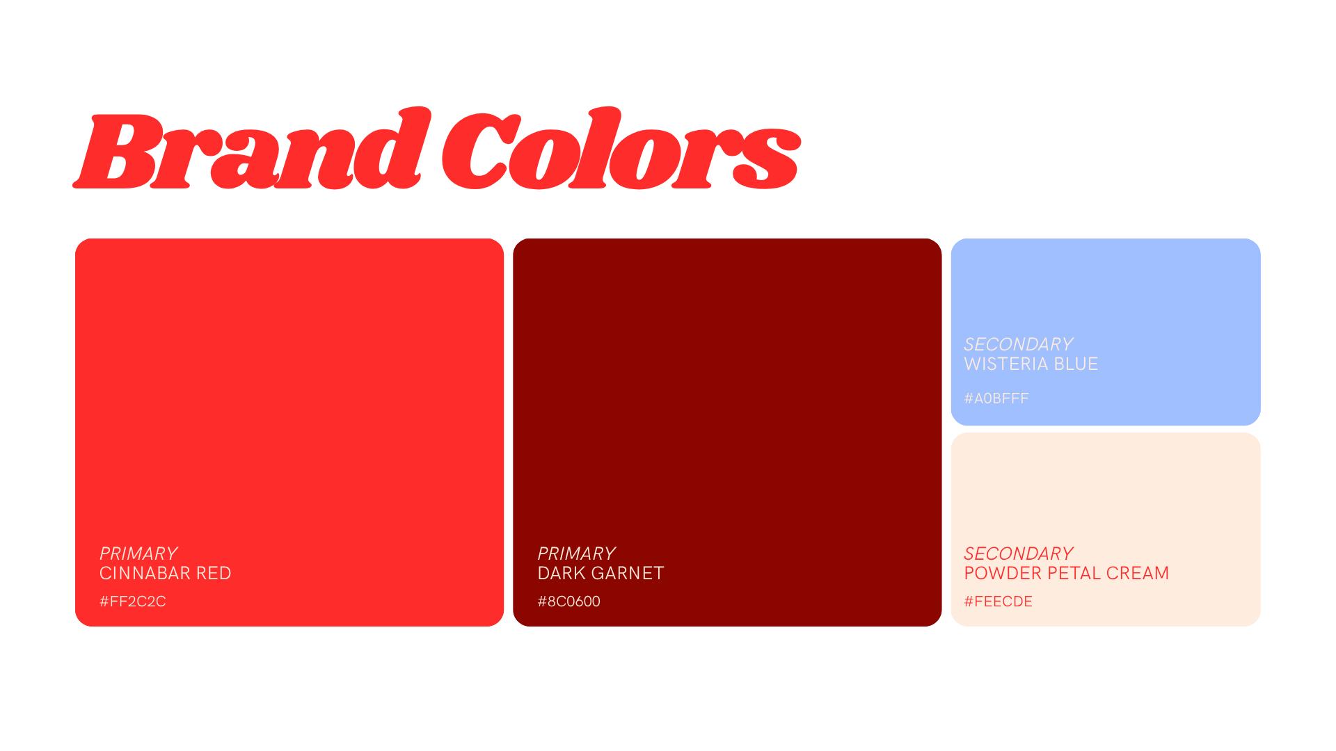
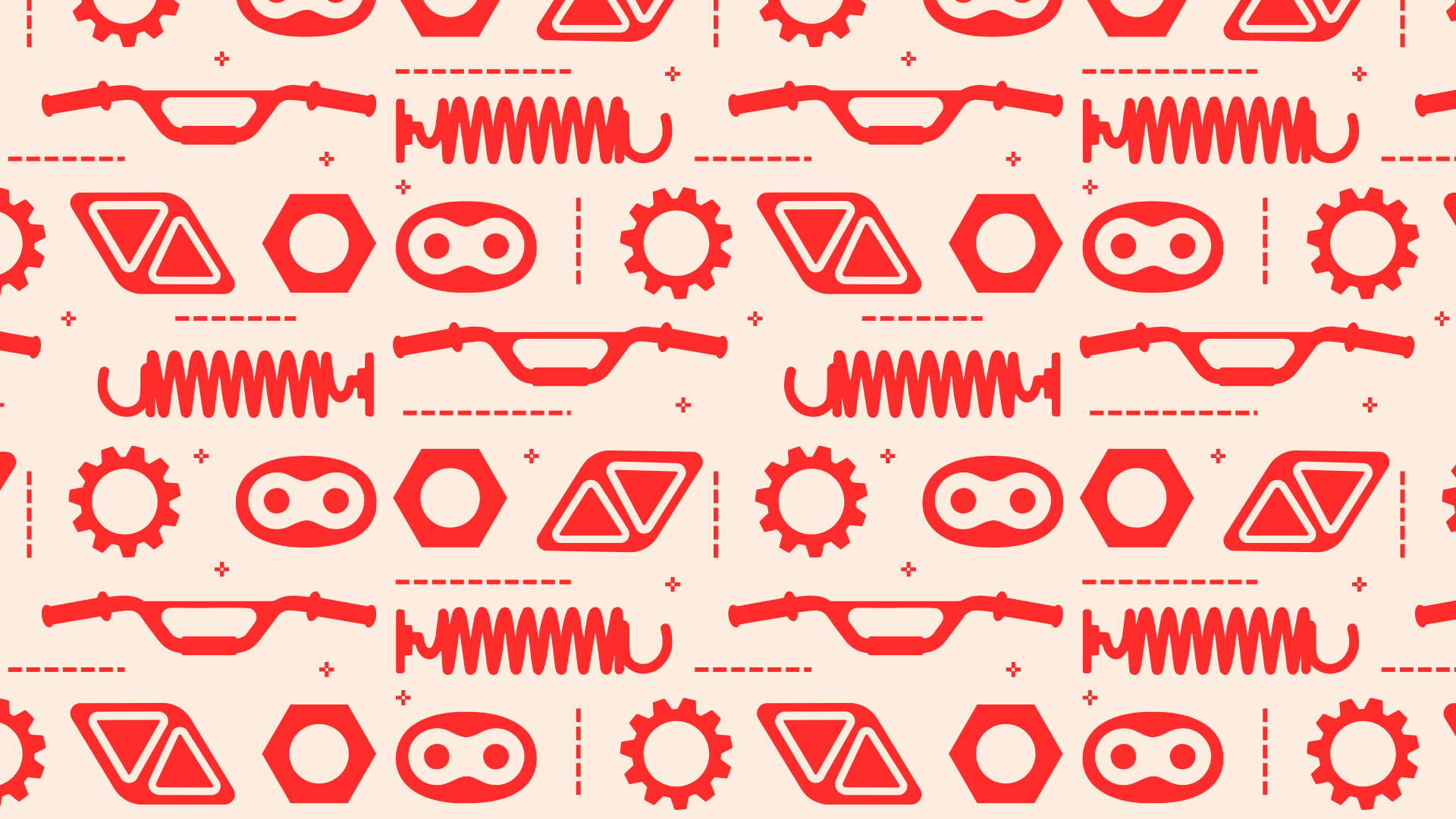
A bright red-pink and periwinkle palette replaces standard black and white, maintaining category recognition while softening the tone. Rounded forms move away from the sharp, aggressive norms of the space, creating something more inviting without losing credibility. The custom pig mark integrates mechanical references throughout—a chain-link nose that extends into a repeatable pattern, and a coil spring tail inspired by bike shocks—tying the identity directly back to the components.
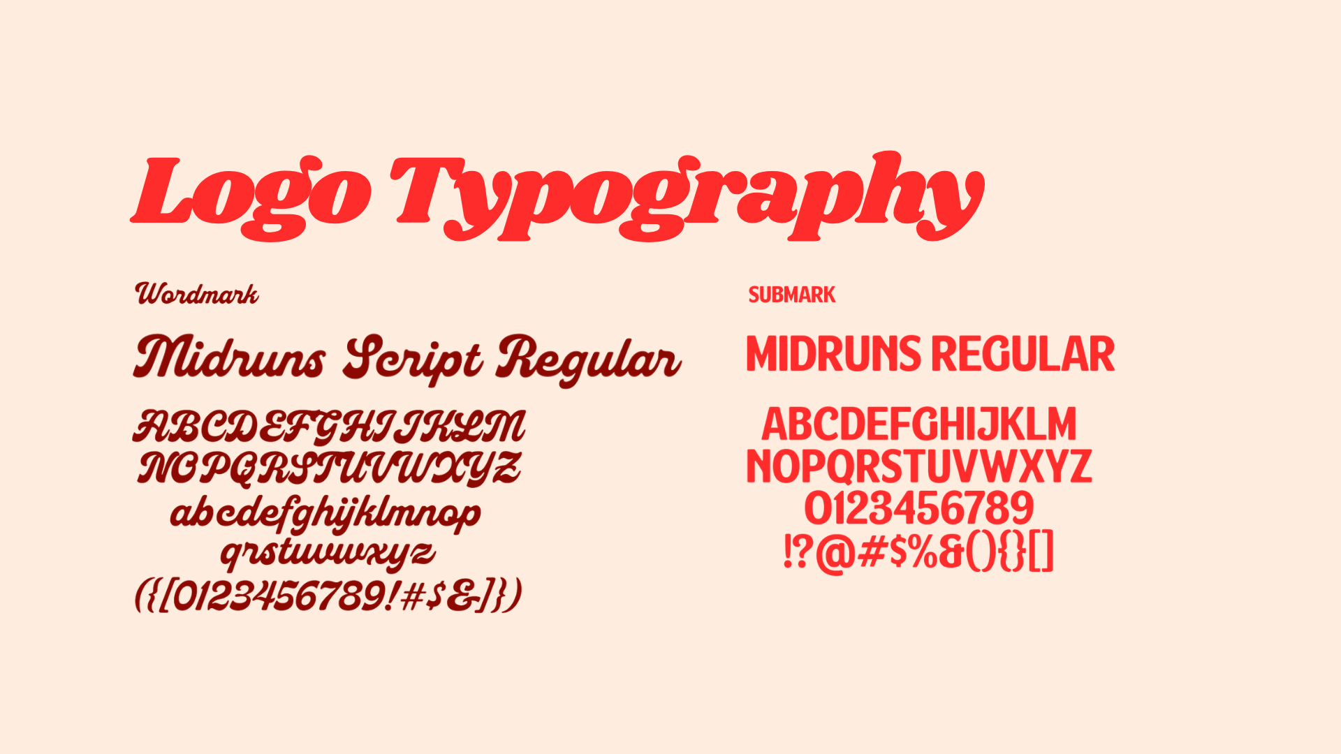
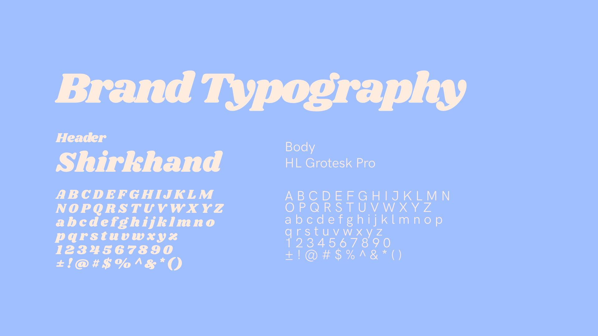
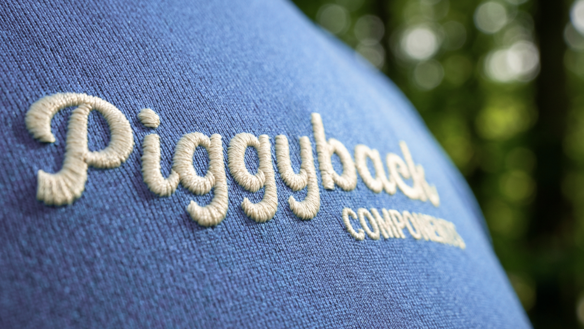
A cursive typeface adds a layer of personality, drawing from classic automotive and bike culture while reinforcing the brand’s more playful, hobbyist-driven audience. The result is a system that feels expressive, cohesive, and built to scale across every touchpoint.