
climate tech startup website redesign
for carbon reform
Role: Head of Marketing
Focus: Website Strategy Information Architecture Messaging & Copy Conversion Design UX
Timeline: 2 months launch + 12 months iteration
I led the strategy, messaging, and design of Carbon Reform’s commercial-launch website to make a complex climate technology understandable, show where it fits in the market, and give sales and prospective customers a tool they could use to independently evaluate the product. Project resulted in:
Monthly traffic grew from a few hundred visitors to 5,000–7,000
200%+ increase in repeat visitors, signaling sustained engagement
Primary education assets used across buying committees
context and problem
After establishing clear brand and category positioning, Carbon Reform’s website no longer reflected the company’s commercial reality. The existing site emphasized vision and sustainability intent but did not clearly explain how the technology worked, who it was for, or what outcomes buyers could expect.
As a result, the website functioned as an introduction rather than a decision-support tool. Prospective customers still required explanation-heavy sales conversations, and the site did not support self-education across multi-stakeholder buying committees. To scale, the website needed to translate brand clarity into a structured, outcome-led experience that could guide buyers from understanding to evaluation and action.
strategy
1. clarify the value proposition
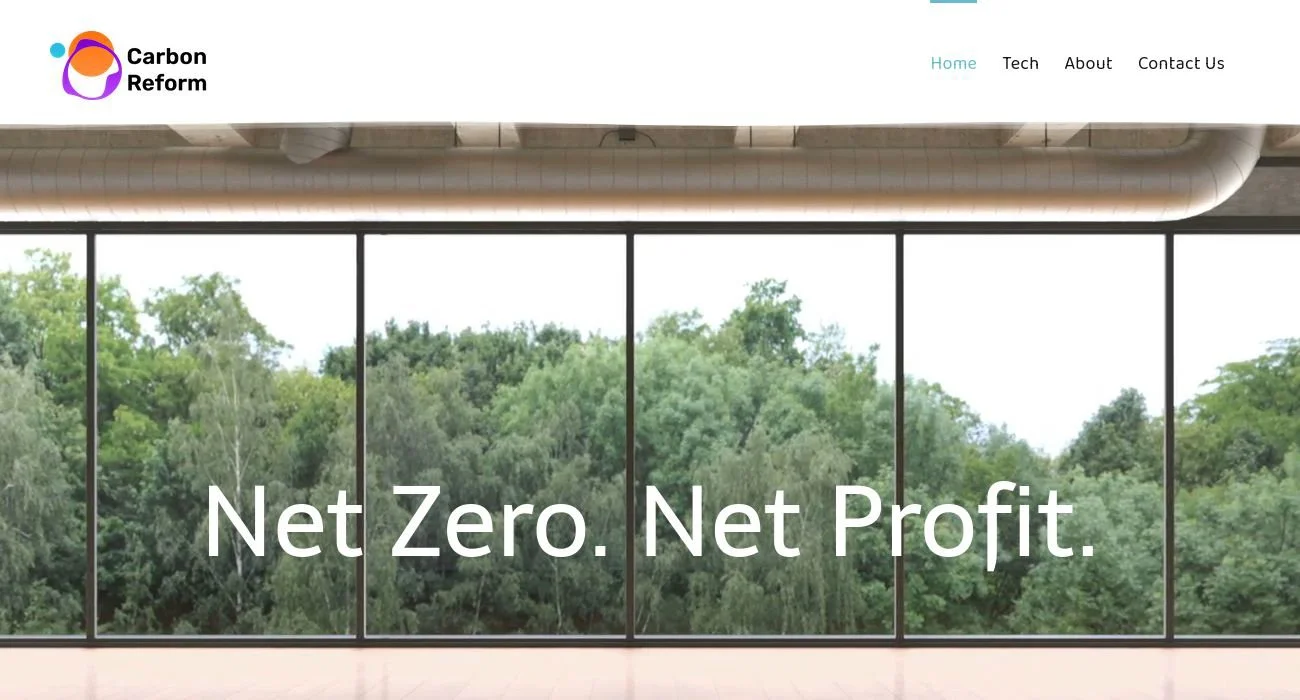
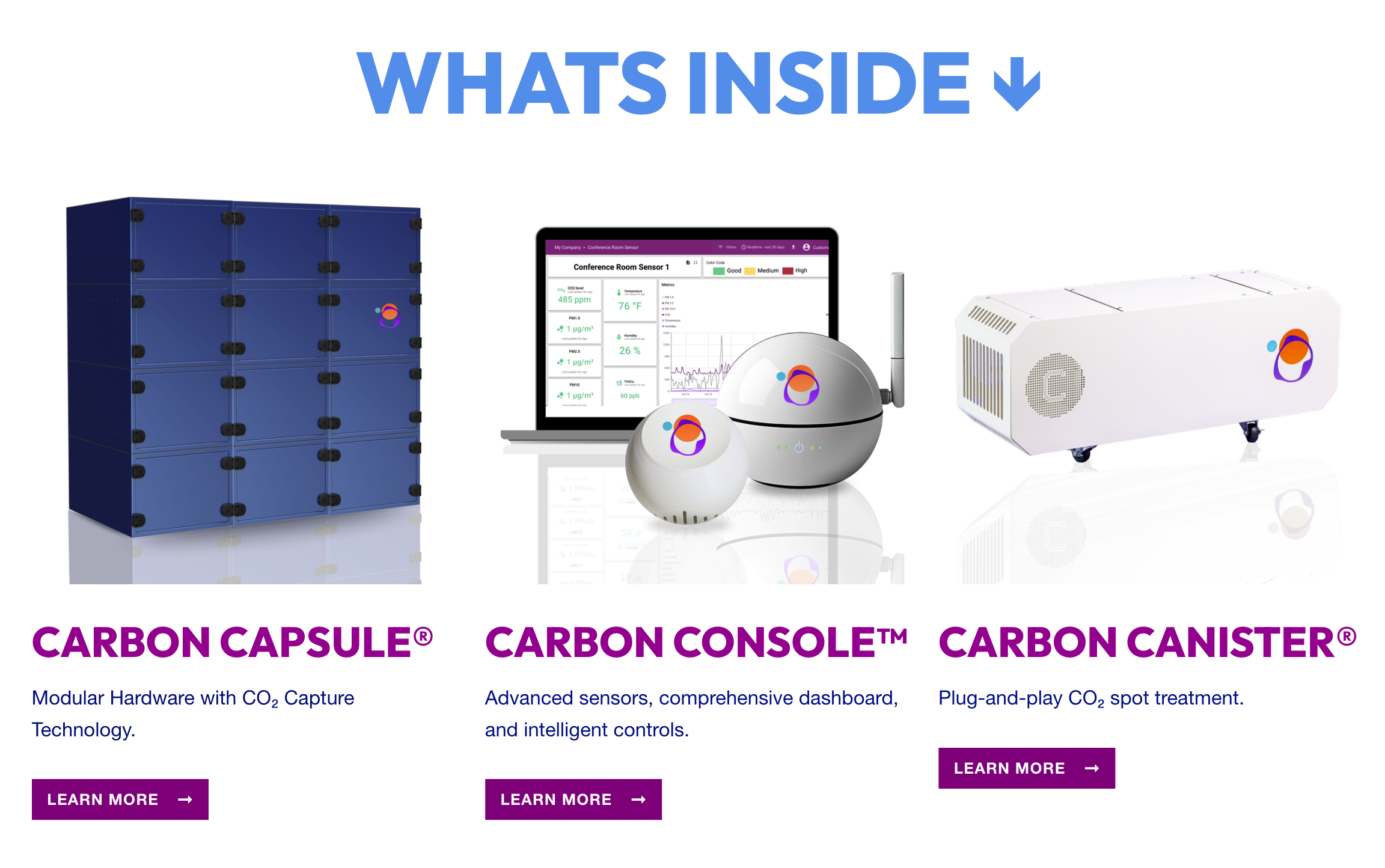
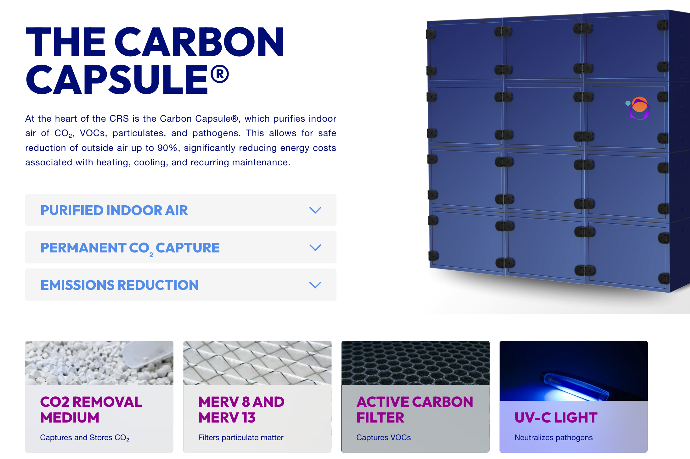
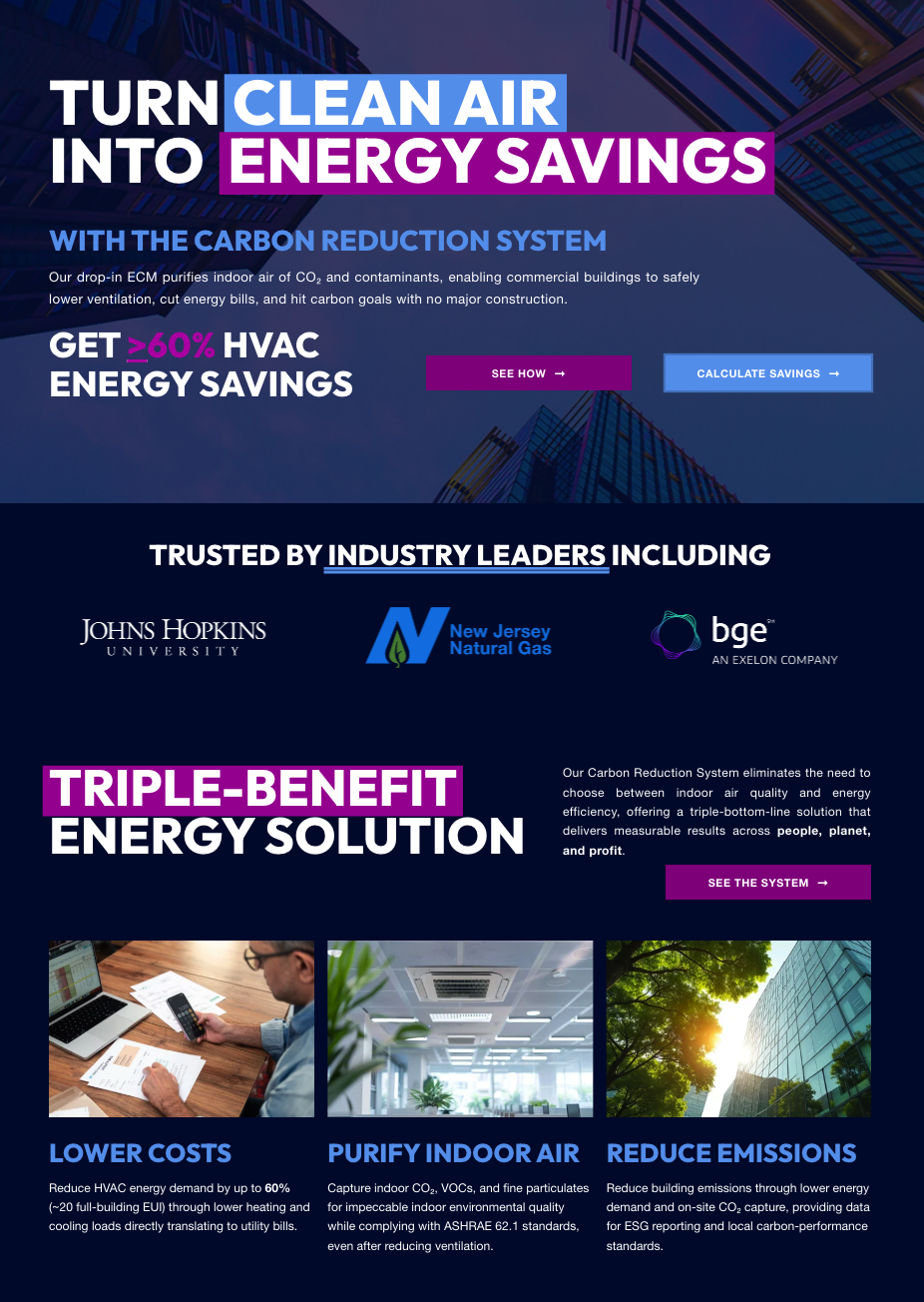
The first thing the new site needed was an efficient homepage and clearly outlined product pages. Layout, hierarchy, and messaging were structured to quickly answer foundational questions: what the technology is, how it works at a high level, and why it matters. Clear page structure, outcome-led headlines, and product-forward visuals reduced cognitive load and helped visitors understand the value of the solution without requiring prior context or a sales conversation.
2. build a personal educational system
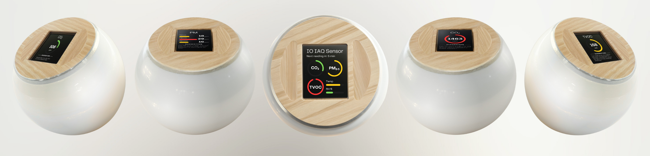
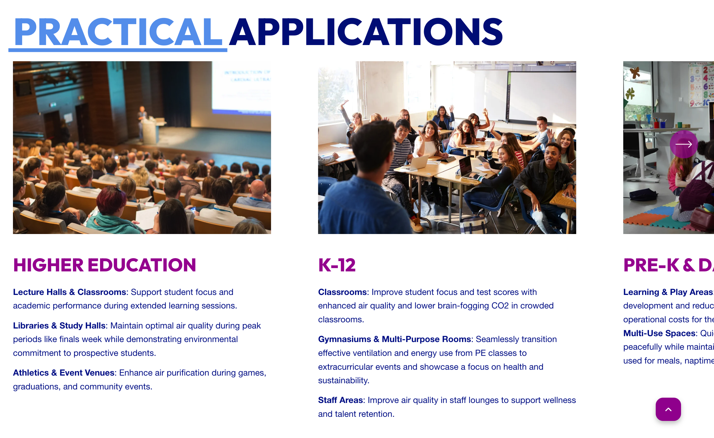
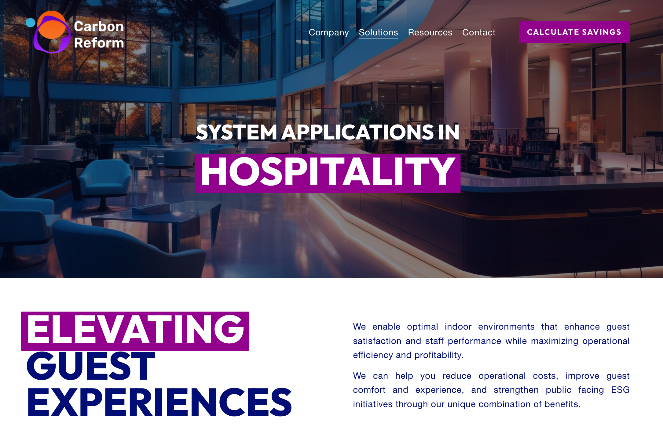
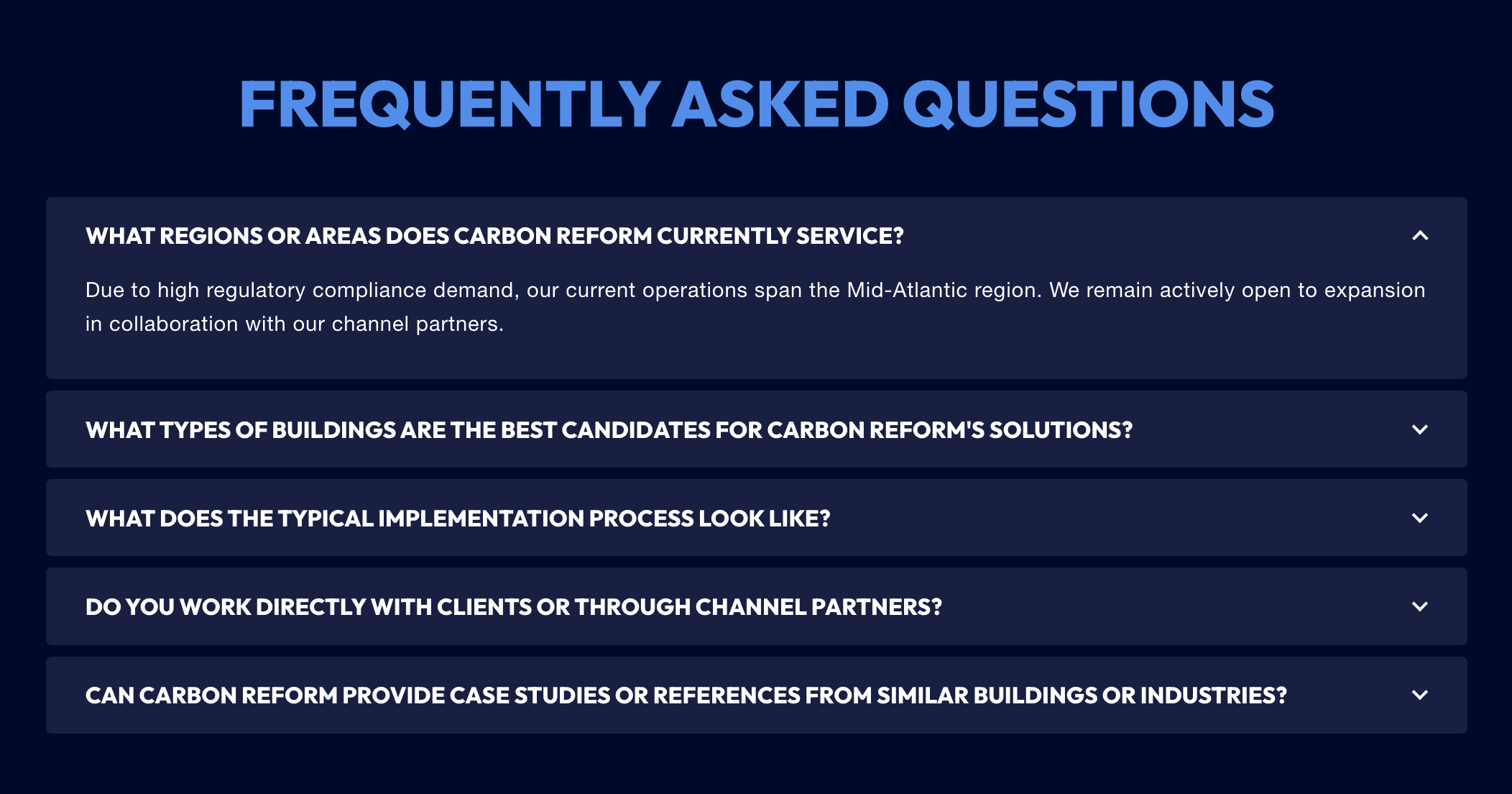
I wanted the website to function as an educational system, not a collection of disconnected pages. I designed industry-specific resources, thought leadership, and supporting content to help buyers understand where Carbon Reform fits within existing energy and sustainability frameworks, while correcting common misconceptions about carbon capture.
Rather than overwhelming visitors with technical detail, I structured content to meet different stakeholders where they were in the evaluation process. This allowed engineers, sustainability leaders, and commercial decision-makers to self-educate at their own depth, using shared language and consistent framing that reinforced credibility and trust.
3. support confident decision-making
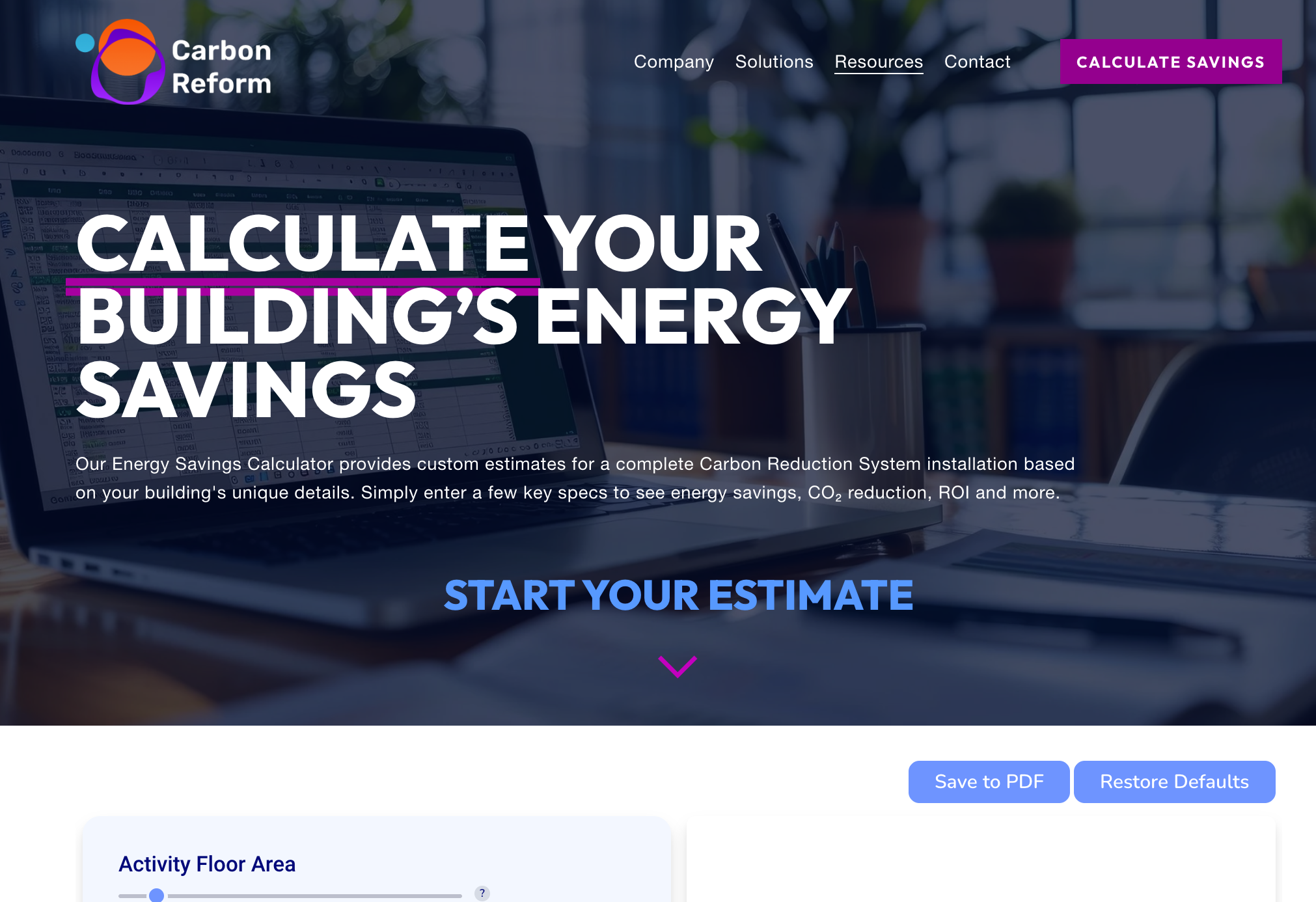
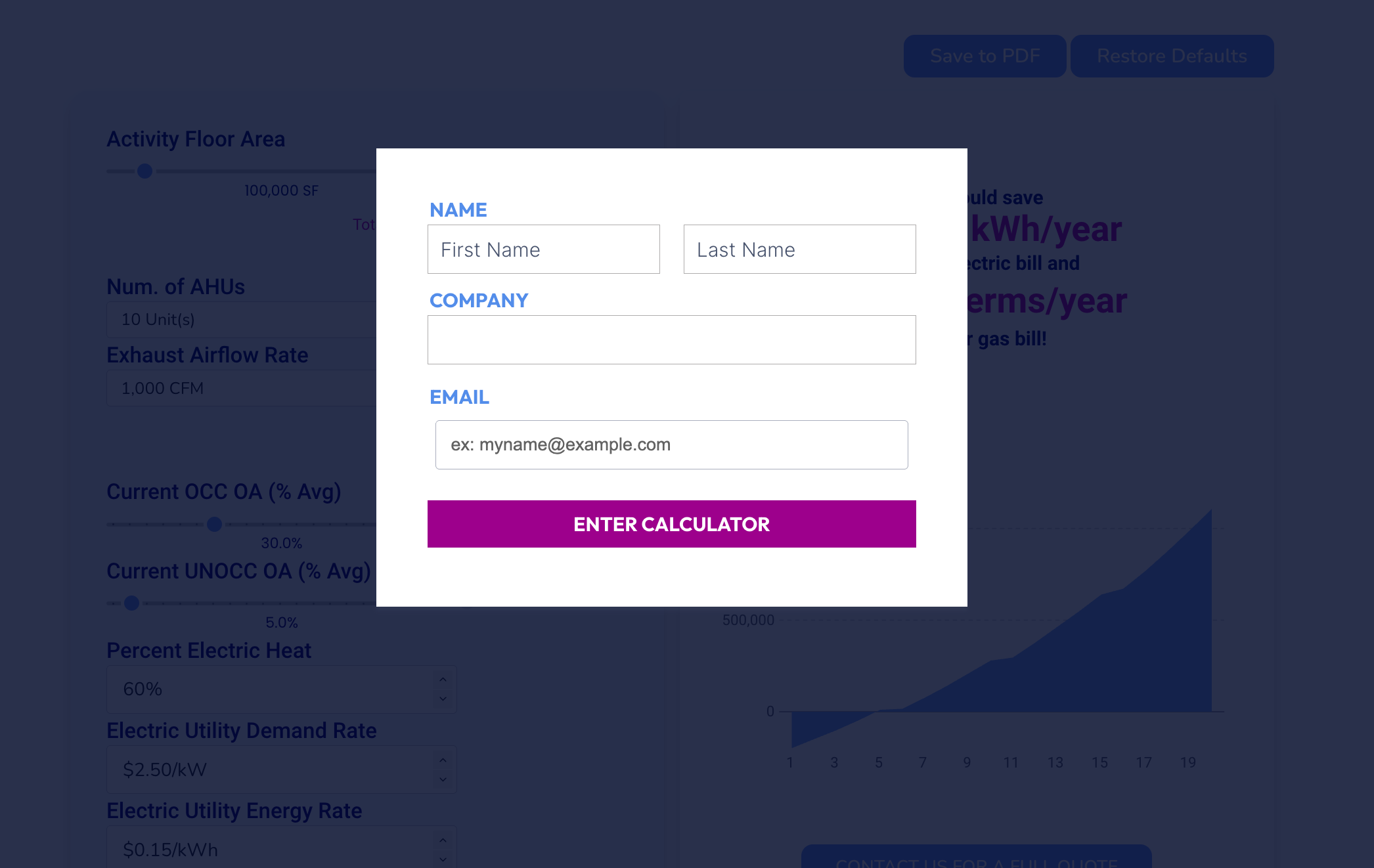
I designed and built an interactive savings and emissions calculator to help prospects understand potential impact in the context of their own buildings. I intentionally gated the tool behind a contact submission that verified email before submission, so buyers could engage meaningfully with the data while creating a natural handoff into sales conversations grounded in their specific inputs.
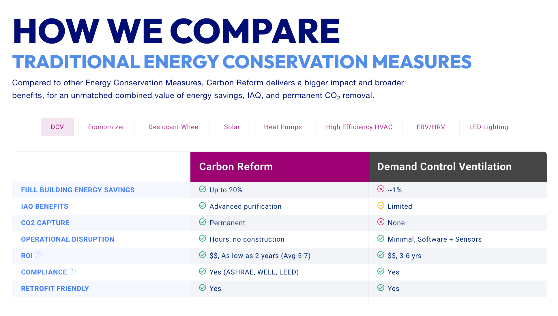
I also wanted to address how buyers were already thinking about solutions. Instead of comparing Carbon Reform only to direct technical competitors, I built a “How We Compare” framework that maps the technology against familiar options like solar and other energy efficiency measures. Using tabbed comparisons, I helped prospects evaluate a first-of-its-kind category alongside the alternatives they were already considering, making the technology easier to contextualize and justify internally.
Execution
Rebuilt the website end to end, translating brand and category strategy into a buyer-ready digital experience
Defined homepage value proposition, messaging hierarchy, and buyer flow to orient visitors quickly and reduce friction
Designed and built a gated, interactive savings and emissions calculator using light HTML and form validation to support lead qualification and sales handoff
Implemented UX enhancements through platform plugins and custom configuration to improve clarity, navigation, and usability
Developed product, sector, and regulatory education pages to support industry-specific evaluation and multi-stakeholder understanding
iMpact
The website became a primary education and evaluation resource across multi-stakeholder buying committees
Sales conversations shifted from foundational explanation to implementation, outcomes, and decision-making
Buyers were able to quantify savings and contextualize the technology using familiar mental models
Established a scalable digital foundation that supported ongoing growth, iteration, and downstream sales enablement